Design Philosophies
Slide 4 of 9


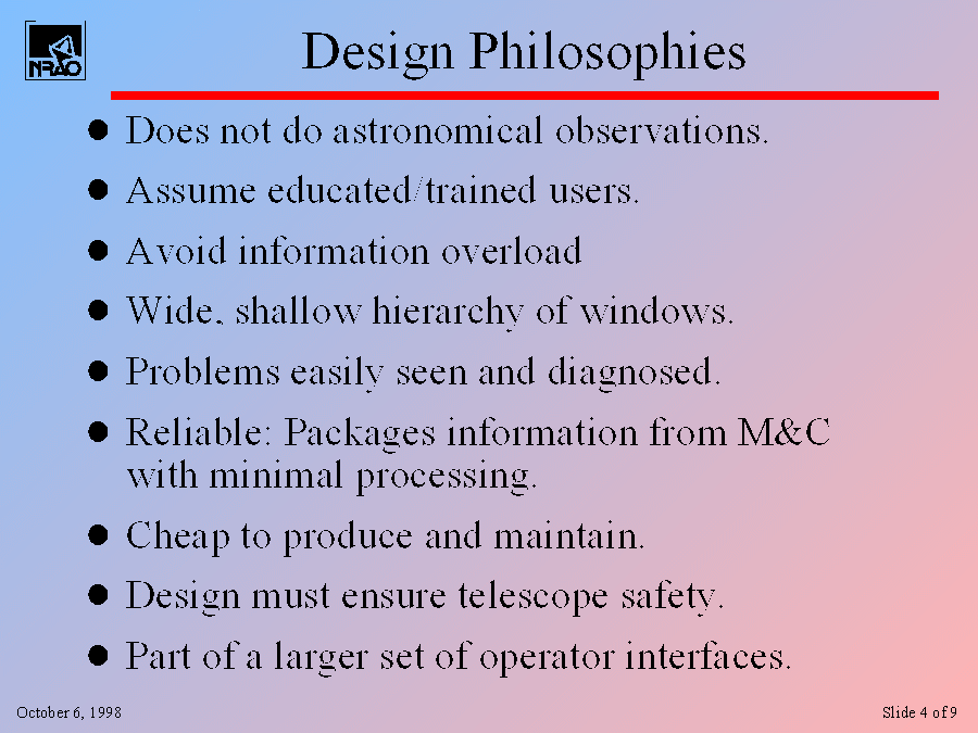
When I'm designing and creating screens, there are some basic design philospohies I have to try to adhere to whenever possible.
The intraface has to be kept simple. Thus, it isn't meant to do everything. For example, the interface doesn't give the operator the powers to make an 'astronomical' observations
I'm not writing an interface for Jane Public but for someone who has many weeks of training.
Too much information all at once is bad. I'm happy to say that the interface for the operators is vastly simpler than that we currently provide our operators at many of our other telescopes like the 140-ft. The interface is so much simpler that a possible problem may actually be keeping operators awake.
To avoid overload, I'm using a wide and shallow hierarchy of windows -- only a few mouse clicks will get you to any screen.
The M&C system further simplyfies the interface since th M&C software has the potential to catch poblems and report them to the operator beyond anything we have ever had before.
Reliability is key. For example, I try to minimize the amount of pocessing between the information M&C provides and what gets displayed.
Cheap -- (has to be since I'm the only one doing the work). An average device takes about two days to create its interface. 1/2 of that goes into layout and design, the other half into coding. Maintnance costs should be low since the GUI builder I've decided to use is publicly available and supported.
Even though it might be a 'cheap' interface, safety is never to be compomised.
Note that the operators will work with a suite of interfaces, not just the ones I'm devloping.

